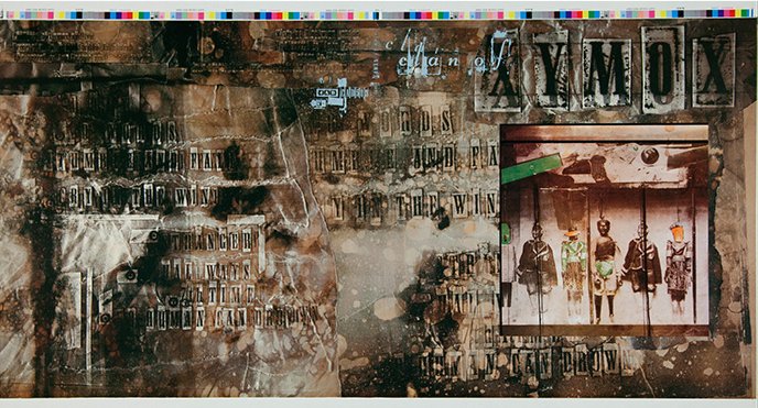
My first job was at a record shop (Camelot Music, a staple of ’80s shopping malls), and I enjoyed a generous employee discount. That offered the freedom to purchase records based on the cover art — if the cover’s cool, the music’s gotta be cool, right? — and a lot of those records would be released on the seminal British label 4AD. The enticing cover art was by 23 Envelope, the design team of Vaughan Oliver and photographer Nigel Grierson.
Years ago, I wrote about the power of cover art in a tribute to Factory Records boss Tony Wilson. There was a cool record shop in the beach town where my grandmother lived. It was next to the grocery store, so, while visiting my grandmother, I’d pop in to look at records when she’d go for groceries. I was 12 or 13 years old and recall seeing those early New Order records — Movement and Everything’s Gone Green — sitting in the mysterious bin labeled ‘imports.’ These records were strange, not like anything that I’d seen, and it was impossible to resist their vibe. It would be a couple more years until I heard these records, but the sound, the feeling, wasn’t that far off from the cover art’s first impressions. The designer was Peter Saville, often mentioned in influence alongside Vaughan Oliver, and it was like he was transmitting signals to me across the Atlantic.
That’s what remarkable cover art — or design in general — does to us. It’s an invitation to decode, revealing (or hinting at) the intention of the creator. Or, as Oliver told an interviewer, “[An album] cover should work as an entrance door that invites you to cross it.”

It’s not a stretch to believe there would be a lot fewer graphic designers in the world if not for Vaughan Oliver and Peter Saville. I can’t think of a single designer friend of a specific age range that wasn’t significantly inspired by the outputs of 4AD and Factory. But it wasn’t only budding designers who received inspiration. There are also a lot more independent labels because of these designs. Or a lot more labels that approached everything they did as a representative package.
Oliver understood that the appeal he added to 4AD was emotional, that fans of the label picked up on common threads and identified a community. Oliver stated, “This was kind of branding before branding—and I generally don’t use the word branding—but it was creating a vibe that made you trust in something.” He continued:
I was always a bit wary of putting an identity on the label itself, but I wanted individual identities for the bands that were consistent. Then, with time, you would see a thread start to appear. There was a unity, but without a corporate branding stamp on it. It was very fluid. Eventually, it became an emotional response that people had with the work. Thirty years later, I’m talking to students who call it “emotional branding”—how people become emotionally involved in what we were doing. I’ve got clients who ask, “How can we have that now?” I say, “We don’t have that now. It builds with time; it also builds with the quality of the product.”
It’s a challenge to create this emotional community without the tangible effects of a physical totem. It’s not impossible — many well-crafted artist websites successfully transmit intention to potential fans. But basing an artist’s vibe on the limitations of a social media platform’s template or a thumbnail in a streaming app is a losing battle. The Guardian’s Ben Beaumont-Thomas said it well: “[Vaughan Oliver’s cover] design tells you that you’re about to go on a journey. With streaming, you’re suddenly teleported in without a map.”
Unlike Oliver, I’m not afraid to use the term ‘branding’ as long as I get to define how I use it. And I define branding, in music, as the promise an artist makes to her audience. That’s the vibe of trust that Oliver refers to above, and it’s essential. An artist or label that gains that trust, that cultivates a community, that repeatedly transmits a signal, becomes a cultural curator. An expectation grows in the listener, and this expectation is a necessary tension. What’s next? Will this label fulfill my expectations? How will this artist continue to reward her community of fans?
That’s how we felt about 4AD. The cover art, the music, the ambiguity allowing us to fill in our own interpretations — these worked together to build our tribe. If, circa 1985, I saw you pick up a Cocteau Twins album in the record store I’d strike up a conversation. We’re in the same club.
I’m sure that Vaughan Oliver, 23 Envelope, and label founder Ivo Watts-Russell partly knew what they were doing. But I also think they stumbled into a lot of this. The point here is that it’s not that difficult. It’s all about developing intention. Understand who you want to reach, as narrowly as possible, and create only for them. Cohesively apply that aesthetic to everything you deliver to the world.
Vaughan Oliver passed away in the final days of 2019. As I commented on Twitter, it’s a triumph to be remembered for a distinctive contribution to culture and style; one that’s identifiably his own as well as freely lent to others. Oliver transitioned to education in his last decade, and that’s fitting. Many of us in the music industry were his students. He taught us all a lot, and, in a more ephemeral digital age, these lessons now serve a higher purpose.
🔗→ Lost worlds of sex and magic: Vaughan Oliver’s album sleeves for 4AD
🔗→ Sight, touch, hearing: an interview with Vaughan Oliver
🔗→ Vaughan Oliver (Interview Magazine)
🔗→ Cover Star: Vaughan Oliver interview
🔗→ interview with graphic designer vaughan oliver