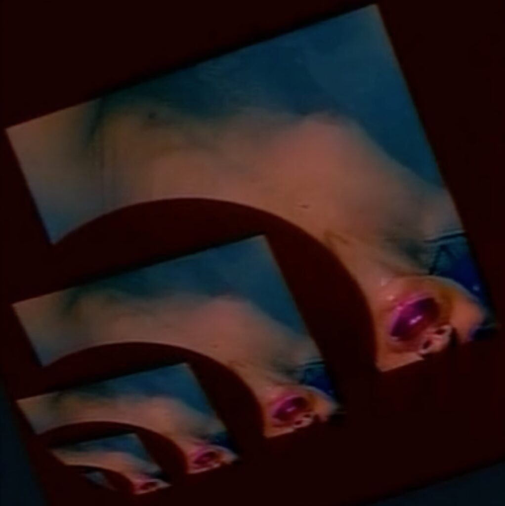
Brian Eno’s 1984 video + music installation Thursday Afternoon is currently on display in the window of London’s Paul Stolper Gallery. It’s also available to stream from the gallery’s site — and in the correct aspect ratio.
the scene celebrates itself
by M Donaldson // Leave a Comment

Brian Eno’s 1984 video + music installation Thursday Afternoon is currently on display in the window of London’s Paul Stolper Gallery. It’s also available to stream from the gallery’s site — and in the correct aspect ratio.
by M Donaldson // Leave a Comment

Primer and Upstream Color are divisive love-them-or-hate-them movies (full disclosure: I love them both), but filmmaker Shane Carruth should inspire everyone. Artistically, he’s taken ‘control freak’ to new levels by assuming each crucial filmmaking role — writer, director, ‘star,’ cinematographer, editor, music composer, distributor, and others — to maintain a challenging vision and cut costs. We can also apply ‘control freak’ to how his direct authority over these aspects gives him ownership of the end product. If Upstream Color were an album1Actually, the soundtrack album is available, it’s fantastic, and you should listen to it., we’d say that Carruth owns his masters and publishing.
When a creator wishes to do projects on a large scale, full control over rights is the most problematic element to sustain. The funding for big projects is usually traded for a loss of intellectual property rights. That might explain Carruth’s apparent frustration in an interview for The Hot Corn:
“I’ve got a massive thing that I’m doing, and after that I’m gonna get out of this, I’m gonna get out of film after this. I’ve got another half of my life to live and I want to think about charities and finding a way to help people, not doing this bullshit, caring about box office, distribution and all this.”
It’s no wonder that our most independent artists are feeling discouraged as capitalism spirals out of control. On the musician’s side, succumbing to a dependency on corporate platforms like Facebook and Spotify is stifling. It’s artistically dispiriting to rely on partners who care little about the craft that goes into a perennial work.
That’s why artists should create their own models. If we work in a niche and desire an impactful statement of our design, then we need to accept that the tech-giants aren’t on our side. There will be compromises to these new models — we probably won’t be able to fund ambitious projects like The Modern Ocean — but constraints help make great art. We need to prepare ourselves because the large, investor-driven platforms we rely on are going to leave music behind. They’ve already started. And we prepare by forming networks, our own distribution outlets, and doubling down on our niches and existing audiences. This route is possible when we use the powerful tools of the internet for our benefit, not to add additional value to a corporate interest through our content and access to our fanbases.
I imagine the interviewer caught Shane Carruth on a bad day. The filmmaker has already embraced progressive release models and knows what they offer. After all, he self-distributed Upstream Color from a website the same day as its limited theatrical launch. That feat was bold and forward-thinking at the time, and it would be both those things today. Hopefully, Carruth will combine a need to help people with his talent for innovative story-telling and develop many meaningful films. It’s doubtful he’ll match the preferred scale of the abandoned projects that inspire his frustration. But I don’t doubt any new work will prove impactful because of Carruth’s insistence on total independence as a guiding artistic constraint.
🔗→ Shane Carruth on The Dead Center and why he’s quitting film for good
🔗→ Your Daily Reminder That Gigantic Media Corporations Are Bad and Cinema is Suffering
by M Donaldson // 1 Comment

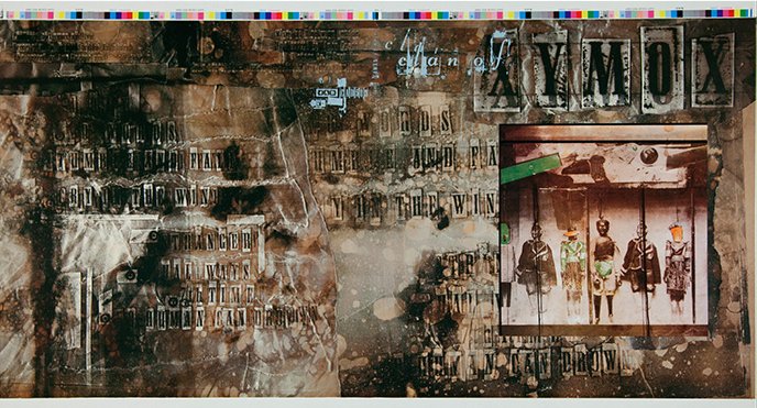
My first job was at a record shop (Camelot Music, a staple of ’80s shopping malls), and I enjoyed a generous employee discount. That offered the freedom to purchase records based on the cover art — if the cover’s cool, the music’s gotta be cool, right? — and a lot of those records would be released on the seminal British label 4AD. The enticing cover art was by 23 Envelope, the design team of Vaughan Oliver and photographer Nigel Grierson.
Years ago, I wrote about the power of cover art in a tribute to Factory Records boss Tony Wilson. There was a cool record shop in the beach town where my grandmother lived. It was next to the grocery store, so, while visiting my grandmother, I’d pop in to look at records when she’d go for groceries. I was 12 or 13 years old and recall seeing those early New Order records — Movement and Everything’s Gone Green — sitting in the mysterious bin labeled ‘imports.’ These records were strange, not like anything that I’d seen, and it was impossible to resist their vibe. It would be a couple more years until I heard these records, but the sound, the feeling, wasn’t that far off from the cover art’s first impressions. The designer was Peter Saville, often mentioned in influence alongside Vaughan Oliver, and it was like he was transmitting signals to me across the Atlantic.
That’s what remarkable cover art — or design in general — does to us. It’s an invitation to decode, revealing (or hinting at) the intention of the creator. Or, as Oliver told an interviewer, “[An album] cover should work as an entrance door that invites you to cross it.”

It’s not a stretch to believe there would be a lot fewer graphic designers in the world if not for Vaughan Oliver and Peter Saville. I can’t think of a single designer friend of a specific age range that wasn’t significantly inspired by the outputs of 4AD and Factory. But it wasn’t only budding designers who received inspiration. There are also a lot more independent labels because of these designs. Or a lot more labels that approached everything they did as a representative package.
Oliver understood that the appeal he added to 4AD was emotional, that fans of the label picked up on common threads and identified a community. Oliver stated, “This was kind of branding before branding—and I generally don’t use the word branding—but it was creating a vibe that made you trust in something.” He continued:
I was always a bit wary of putting an identity on the label itself, but I wanted individual identities for the bands that were consistent. Then, with time, you would see a thread start to appear. There was a unity, but without a corporate branding stamp on it. It was very fluid. Eventually, it became an emotional response that people had with the work. Thirty years later, I’m talking to students who call it “emotional branding”—how people become emotionally involved in what we were doing. I’ve got clients who ask, “How can we have that now?” I say, “We don’t have that now. It builds with time; it also builds with the quality of the product.”
It’s a challenge to create this emotional community without the tangible effects of a physical totem. It’s not impossible — many well-crafted artist websites successfully transmit intention to potential fans. But basing an artist’s vibe on the limitations of a social media platform’s template or a thumbnail in a streaming app is a losing battle. The Guardian’s Ben Beaumont-Thomas said it well: “[Vaughan Oliver’s cover] design tells you that you’re about to go on a journey. With streaming, you’re suddenly teleported in without a map.”
Unlike Oliver, I’m not afraid to use the term ‘branding’ as long as I get to define how I use it. And I define branding, in music, as the promise an artist makes to her audience. That’s the vibe of trust that Oliver refers to above, and it’s essential. An artist or label that gains that trust, that cultivates a community, that repeatedly transmits a signal, becomes a cultural curator. An expectation grows in the listener, and this expectation is a necessary tension. What’s next? Will this label fulfill my expectations? How will this artist continue to reward her community of fans?
That’s how we felt about 4AD. The cover art, the music, the ambiguity allowing us to fill in our own interpretations — these worked together to build our tribe. If, circa 1985, I saw you pick up a Cocteau Twins album in the record store I’d strike up a conversation. We’re in the same club.
I’m sure that Vaughan Oliver, 23 Envelope, and label founder Ivo Watts-Russell partly knew what they were doing. But I also think they stumbled into a lot of this. The point here is that it’s not that difficult. It’s all about developing intention. Understand who you want to reach, as narrowly as possible, and create only for them. Cohesively apply that aesthetic to everything you deliver to the world.
Vaughan Oliver passed away in the final days of 2019. As I commented on Twitter, it’s a triumph to be remembered for a distinctive contribution to culture and style; one that’s identifiably his own as well as freely lent to others. Oliver transitioned to education in his last decade, and that’s fitting. Many of us in the music industry were his students. He taught us all a lot, and, in a more ephemeral digital age, these lessons now serve a higher purpose.
🔗→ Lost worlds of sex and magic: Vaughan Oliver’s album sleeves for 4AD
🔗→ Sight, touch, hearing: an interview with Vaughan Oliver
🔗→ Vaughan Oliver (Interview Magazine)
🔗→ Cover Star: Vaughan Oliver interview
🔗→ interview with graphic designer vaughan oliver
by M Donaldson // Leave a Comment
My longtime friend David and his equally creative wife Jennifer strike again. There’s information on the genesis of this impressive feat of Kraftwerk kunstwerk on his blog.
by M Donaldson // Leave a Comment
Engineer Phill Brown, speaking to the Guardian in 2012, recalled “an endlessly blacked-out studio, an oil projector in the control room, strobe lighting and five 24-track tape-machines synced together. Twelve hours a day in the dark listening to the same six songs for eight months became pretty intense.”
Felix Laband – A Life In Collage:
Hailing from Johannesburg South Africa, Felix hasn’t exactly become a household name here in the States. His obscurity made legitimate purchases of his music difficult, so like any rabid fan I resorted in the early 00s to piracy and felt the pain of having shorted an artist that has contributed so much to our well being. But now more than a decade later it’s easier than ever to patronize the artists we love. And so we did, with the largest music-related purchase we’ve ever made.
Psychedelic Supersonic Silicon Space Age: Photos Of The Radical Hippie Design Sense:
In the 1910s, the horrors of the First World War had pushed disillusioned creatives to invent new ‘modernist’ modes of expression. Fifty years later, Vietnam, civil rights, and their political backlash had radical thinkers again refusing to get in line. We all know well the profound musical heritage of this period. But the influence of countercultural aesthetics on the graphic design and architecture of the era is far less recognized, even as its impact continues to ripple some half a century on.
Why Time Seems To Speed Up As We Get Older:
If our memories can trick us into thinking time is moving quickly, then maybe there are ways to trick our brains into thinking that time is slowing down — such as committing to breaking routines and learning new things. You’re more likely to remember learning how to skydive than watching another hour of mindless television.
There’s a Replica of the Otherworldly Bedroom from 2001: A Space Odyssey in a DTLA Warehouse:
{Simon} Birch, a Hong Kong-based British artist, has transformed the space into a series of micro-exhibitions meant to take viewers on a “hero’s journey,” a reference to Joseph Campbell’s Monomyth. The various large-scale immersions feature projections, paintings, sculptures, and, in one instance, a lush patch of real grass. But the most Instagram-worthy is a bedroom—one that happens to be an exact replica of the one in Stanley Kubrick’s Oscar-winning film 2001: A Space Odyssey.
by M Donaldson // Leave a Comment
For your weekend, I present five intriguing missives from across the digital cosmos:
Stevie Wonder and the Radical Politics of Love
Here are three songs, from three albums recorded in three consecutive years, all from the Nixon era. Each year, the lyrics get more pointed, more obvious in their contempt. But it’s a contempt mingled with understanding, and grounded in a deep, deep love for the people most affected by political failure.
Brian Eno’s Latest Isn’t An Album – It’s A Process
The price point corroborates that, asking for the worth not of an album but of a piece of software. But even then, it poses challenges. We expect a certain amount of utility for our buck; I own one other app that costs $40, for example, and it is a cloud-based productivity suite, which is about as utilitarian as it gets. You don’t do anything with Reflection, and it doesn’t do anything for you. What sort of software is that?
On May 19, 1978, Jamaican-born model and singer Grace Jones turned 30. On June 7, she released her second studio album, Fame. Five days later, she celebrated with a combination birthday/album release extravaganza at LaFarfelle Disco in New York. The fun and debauchery were captured on film by notorious paparazzo Ron Galella, who was famous in his own way for relentlessly pursuing celebrities and getting his teeth knocked out by Marlon Brando.
20 Dynamic Paintings From The Italian Futurists
Italian writer Filippo Tommaso Marinetti founded Futurism when he published his Futurist Manifesto in Parisian newspaper Le Figaro on 20th February 1909. Futurism was a key artistic and social development in 20th Century art history, originating and most active within Italy, but also a movement whose ideas spread to Russia, England and beyond.
This is what is most disturbing about “I feel like”: The phrase cripples our range of expression and flattens the complex role that emotions do play in our reasoning. It turns emotion into a cudgel that smashes the distinction — and even in our relativistic age, there remains a distinction — between evidence out in the world and internal sentiments known only to each of us.
by M Donaldson // Leave a Comment
Acclaimed documentarian Adam Curtis is at it again with HyperNormalisation, another stab at explaining the many forces responsible for the confounding state of our present world. Hyperallergic has a fascinating analysis of Curtis’s latest project and pulls this frightening / enlightening quote from the documentary’s narration:
The liberals were outraged by Trump, but they expressed their anger in cyberspace — so it had no effect. The algorithms made sure it only spoke to people who already agreed with them. Instead, ironically, their waves of angry messages and tweets benefited the large corporations who ran the social media platforms. As one analyst put it, ‘angry people click more.’ It meant that the radical fury that came like waves across the Internet no longer had the power to change the world.
Going a bit off path (if you’ll indulge me, as this is primarily a music biz blog), we can also read this as a warning against putting all of one’s promotional efforts into social media. There are indeed many potential listeners to reach through, say, Facebook but there are limits. And those limits – determined by an algorithm you can’t control, and reaching into a bubble of the already converted – won’t give your project much expansion outside of your current circle. It’s low hanging fruit in the short term as you’re hitting those who are into ‘similar music’ (at least those that pay attention to Facebook), but once that’s exhausted there’s nowhere to go, at least organically. Your own site and outside promotional efforts should always be a focus, with social media simply a tool to point the way. Treat social media like another – albeit quite effective – form of newsletter, instead applying the bulk of your energy where it matters and potentially affecting more people.
But I digress. HyperNormalisation is fantastic though IMO not as masterful (or convincing) as 2015’s Bitter Lake. But that’s a high bar, and HyperNormalisation is effective and affecting, with many brilliant examples of Curtis’s hallmark montages and expert music selections working in tandem to wordlessly implant his message. I watched it before the presidential election and its themes continue to haunt (and scar) my thoughts afterwards. If you’re in the UK you can view HyperNormalisation now on the BBC iPlayer. If you’re not, have a look on YouTube and you might just see it pop up now and again.
Artspace recently interviewed Adam Curtis, focusing on HyperNormalisation‘s assertion that a rise in individualism (epitomized in the film by Patti Smith and the ’70s NYC art scene) created an un-unified weakness in liberal movements.
{Curtis:} We look back at past ages and see how things people deeply believed in at the time were actually a rigid conformity that prevented them from seeing important changes that were happening elsewhere. And I sometimes wonder whether the very idea of self-expression might be the rigid conformity of our age. It might be preventing us from seeing really radical and different ideas that are sitting out on the margins – different ideas about what real freedom is, that have little to do with our present day fetishization of the self. The problem with today’s art is that far from revealing those new ideas to us, it may be actually stopping us from seeing them.
This might be quite a difficult one to get over, but I think this is really important: however radical your message is as an artist, you are doing it through self-expression – the central dominant ideology of modern capitalism. And by doing that, you’re actually far from questioning the monster and pulling the monster down. You’re feeding the monster. Because the more people come to believe that self-expression is the end of everything, is the ultimate goal, the more the modern system of power becomes stronger, not weaker.
That whole Artspace interview is a mindfuck, as is pretty much Adam Curtis’s entire output. If this is new to you then prepare yourself for the rabbit hole.
by M Donaldson // Leave a Comment
*Watching the record swirl in the water is an eerie sight, powerfully evoking visuals of the monster floods we’ve watched wipe out human settlements in epic disaster movies as well as in real life. The knob to control the record player is built into a branch that hangs over the pool. *